Why learn how to read candlesticks? Because it may be one of the most used chart views in trading. Here you will pick up the fundamentals of reading candlestick charts, especially how to read candlestick chart for day trading.
What are Candlestick Graphs/Charts?
When looking at stock price charts, do you ever notice how they’re sometimes composed of vertical lines that are fat in one part and thin above or below? Those are called candles or candlesticks, and the carts using them are therefore called candlestick charts. Reading candlesticks is an important skill for technical analysis of price trends.
Candlestick Components
Once you understand the different components of candlestick charts, it becomes easier to see them not as just fatter and thinner lines but rather as useful indicators of price action. Learning how to read candlestick charts is thus a matter of understanding all the parts.
Body
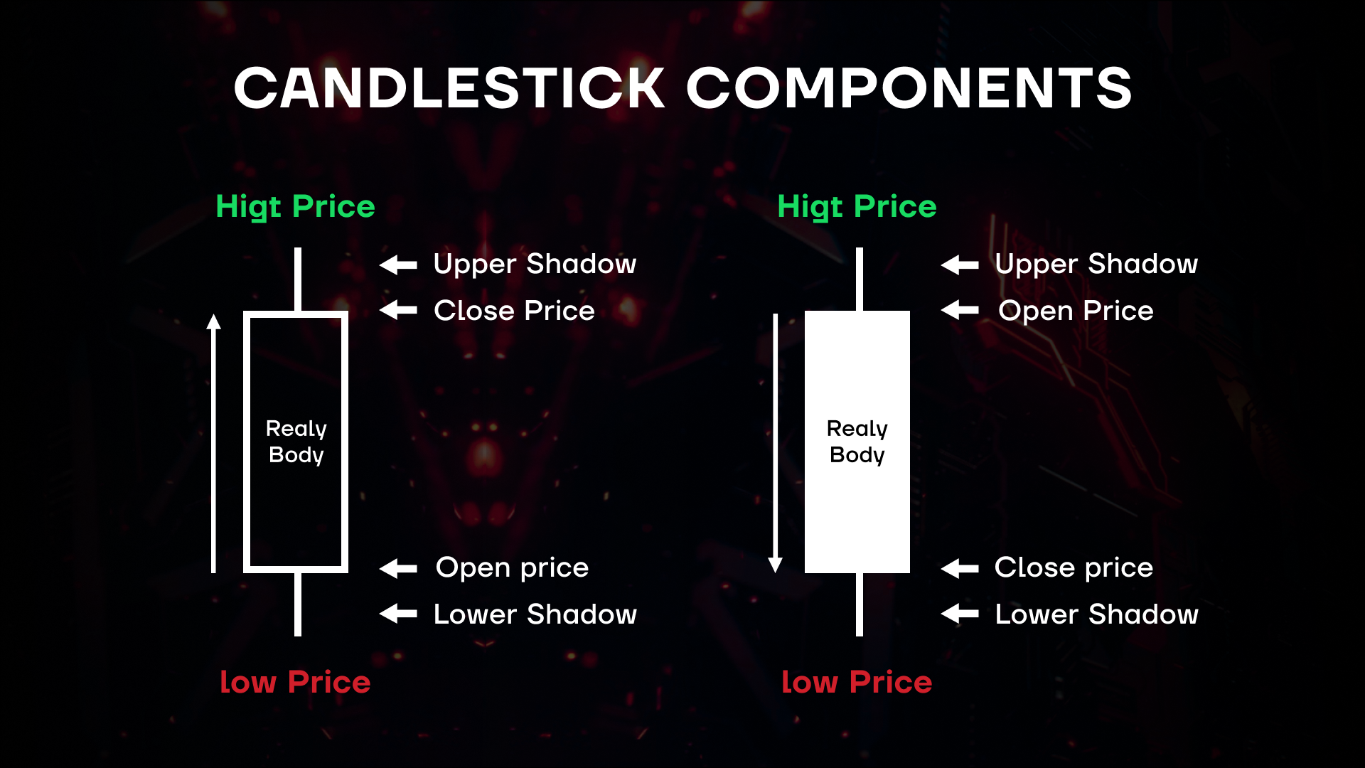
In learning how to read stock candles, start with the fat part, aka the body, sometimes called the “real body.” The body indicates the open and close price of the trading period. Trading periods can be anywhere from a minute to much much longer, depending on how small of a time frame you want to look at.
Color
You’ll never learn how to read a candlestick chart without understanding the role of colors. Normally, charts use green for candlesticks that closed above the open and red for the opposite (at other times white is used instead of green and black for red). Thus, the bottom of the fat part (body) of a green candle is the open price and the top is the close price. In a red candle, the top is the open and the bottom is the close. Depending on the time frame you’re focusing on, the same trades can end up in either a green or red candlestick — it’s up to your trading preferences to choose the time frame you are most interested in.
Wicks
The thin parts of the candle in the candle reading chart are the wicks, reflecting the highest and the lowest the price went in that time frame. They are thus useful to see the whole range of the price action and to spot resistance and support levels during that time interval. You can’t learn how to read a candle chart without learning how to read candle sticks at their thinnest, i.e. the wicks.
Bullish vs. Bearish Candles
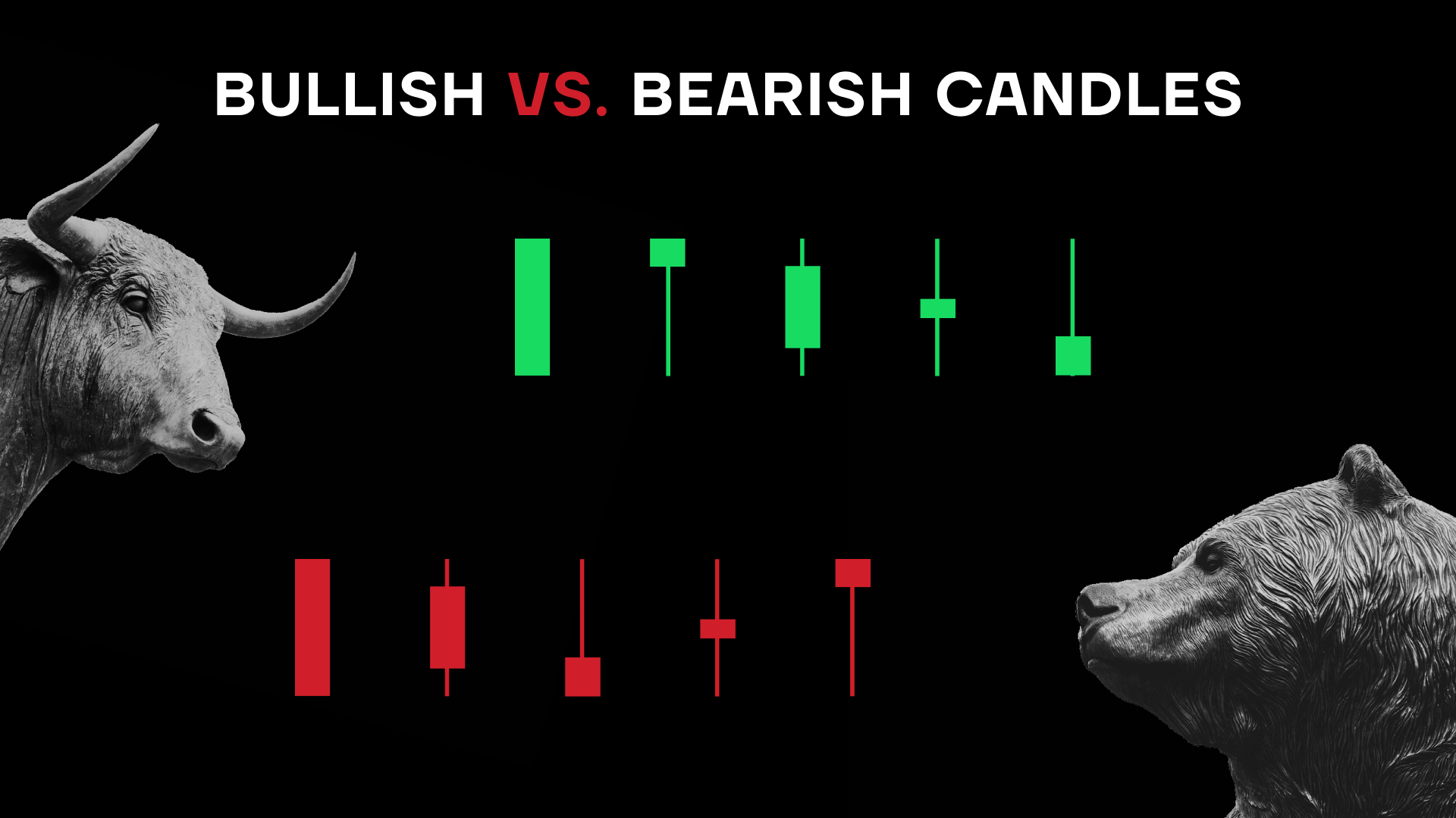
The simple rule is that a green candle is bullish while a red one is bearish, keeping in mind the time frame you chose to observe. No trend goes forever up with no pullbacks nor forever down with no spikes. So seeing a green candle or two on a candle chart does not necessarily indicate a bullish trend just like seeing a few red ones in a row does not necessarily suggest a bearish pattern emerging.

How to Read Candlestick Charts
It’s therefore important to be able to intelligently read candlestick charts. If the wick is short, the close was close to the high/low price. If there are several candles of the same color together, is one of the other color coming up next? If there is a long candle, will it be followed by another long one, a shorter one, or a reversal? Ask yourself questions and do your research. Make sure to look at both the micro and the macro. Through candlesticks stocks indicate their possible price trends. Take a look at different time frames to see if a short trend is part of a longer trend. Compare with historical data. Check the context of the overall market or economic data.

Candlestick Chart Patterns
When reading a candlestick chart, you’re bound to see patterns. Technical traders believe that candlestick patterns are not random. Over the years, they have observed and defined a number of patterns that to them seem to indicate a certain probability for the future of a price trend. Below you’ll see the candlestick chart explained with some of the more common candlestick patterns that traders follow.
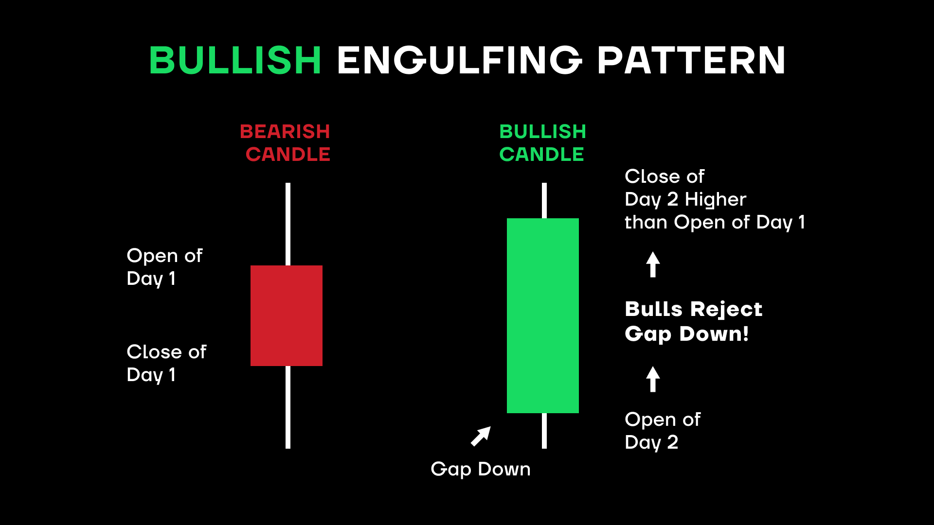
Bullish Engulfing Pattern
In the world of stock candlestick charts, size does matter. So when you see a small candle (with a rather flat fat part – body – and longer wicks being followed by a candle of the opposite color that has a much longer body, you may be witnessing an engulfing pattern. If the flat-bodied candlestick is red (and thus the longer-bodied one is green), the pattern is called bullish engulfing. It’s an important pattern to know when learning how to read candlestick stock charts.
This is especially the case when several red candles are followed by a flat-bodied red candle and then a bigger green candle. It may indicate that the sellers may have run out of steam and the buyers are taking over. When a series of green candles ending in a flat one is followed by a longer red candle, you’re looking at a bearish engulfing pattern.
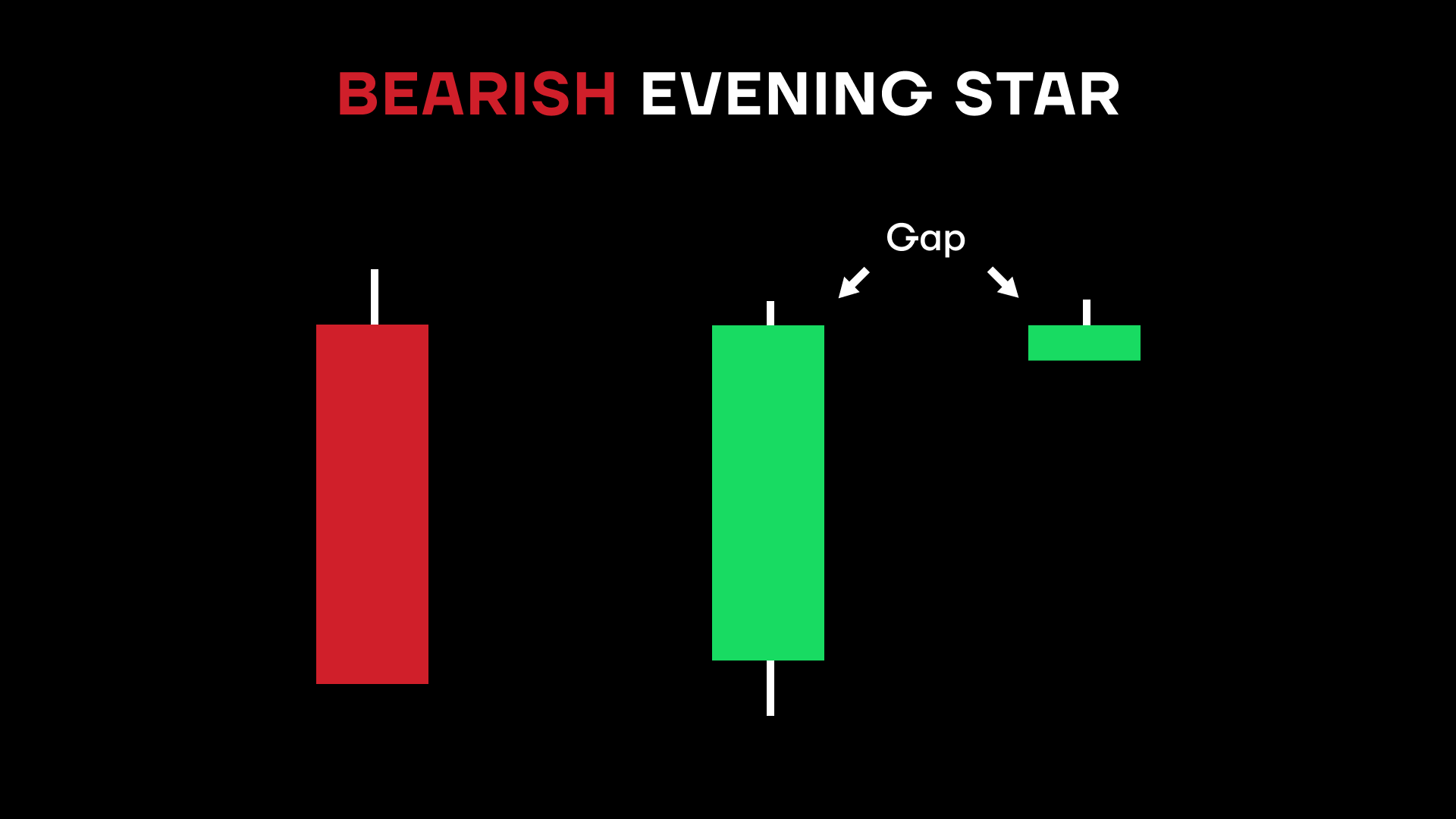
Bearish Evening Star
Now imagine seeing in a candlestick graph an upward trend (several green candles) where one candle suddenly turns red and ends up below the previous (green) candle’s body. Just a flat candle, not sure where it may go next. But then, in the same candle graph, the next candle goes deep in the opposite direction of the candle before the flat one, ending the day deep into the body of the candle two candles ago. In fact, the previous handle could’ve been in the green too. It’s more a matter of comparing the last candle and the one two candles prior. This is an indicator that a trend may have topped out and a reversal is underway.
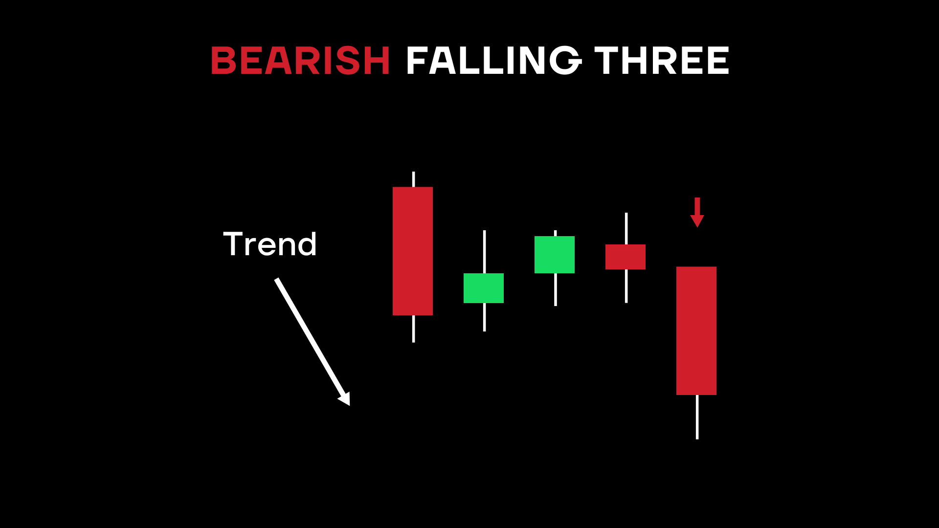
Bearish Falling Three
Sometimes it looks like the trend is going one way and then one candle changes everything. If you see a big red candle followed by three small green ones and then another big red candle, you may be witnessing the Bearish Falling Three. Often, even the third candle of the small green three will not go higher than the opening price of the previous red candle. And the following red candle could go even lower than the clothing price of the first red one.
What if it’s four small green candles, does the pattern still hold? Sure, keep in mind that these are general patterns and that a trader must use his own judgment when acting on any indicators. With candlesticks stock market may be sending a signal or not, it takes patience to expertly learn how to read a candle.
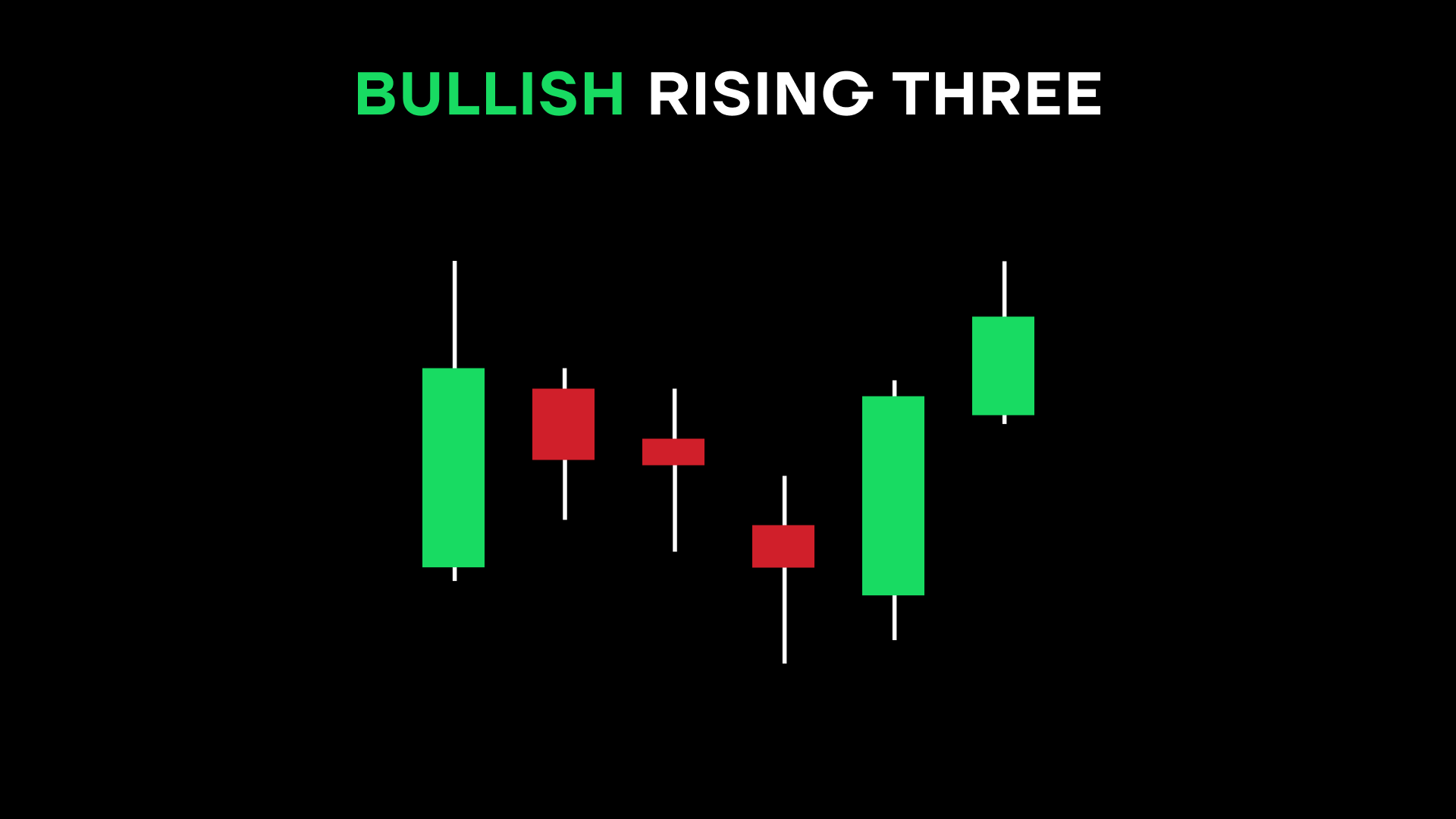
Bullish Rising Three
Basically, the Bullish Rising Three is the opposite of the Bearish Falling Three, with one long green candle, three short red ones, and then again one long green candle. It’s a trend reversal that bulls would be happy to see. Of course, both bullish and bearish patterns are important in analyzing candlestick charts.
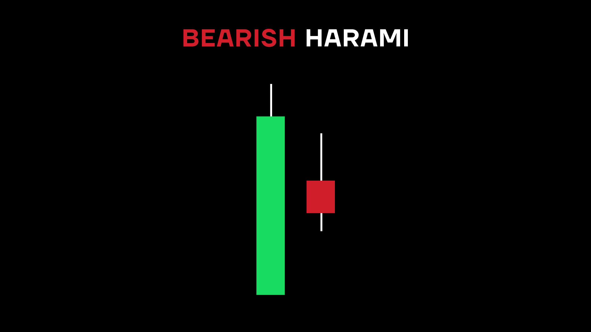
Bearish Harami
The Harami pattern is an unusual one because it’s not necessarily one to act upon immediately. Rather, traders often use it to watch for what happens next. You can thus call it a pattern of indecision. The pattern consists of several green candles followed by a red candle whose body is entirely within the body of the preceding green candle. It’s not low enough to suggest a definitive reversal yet is a cause for concern for bulls nonetheless.
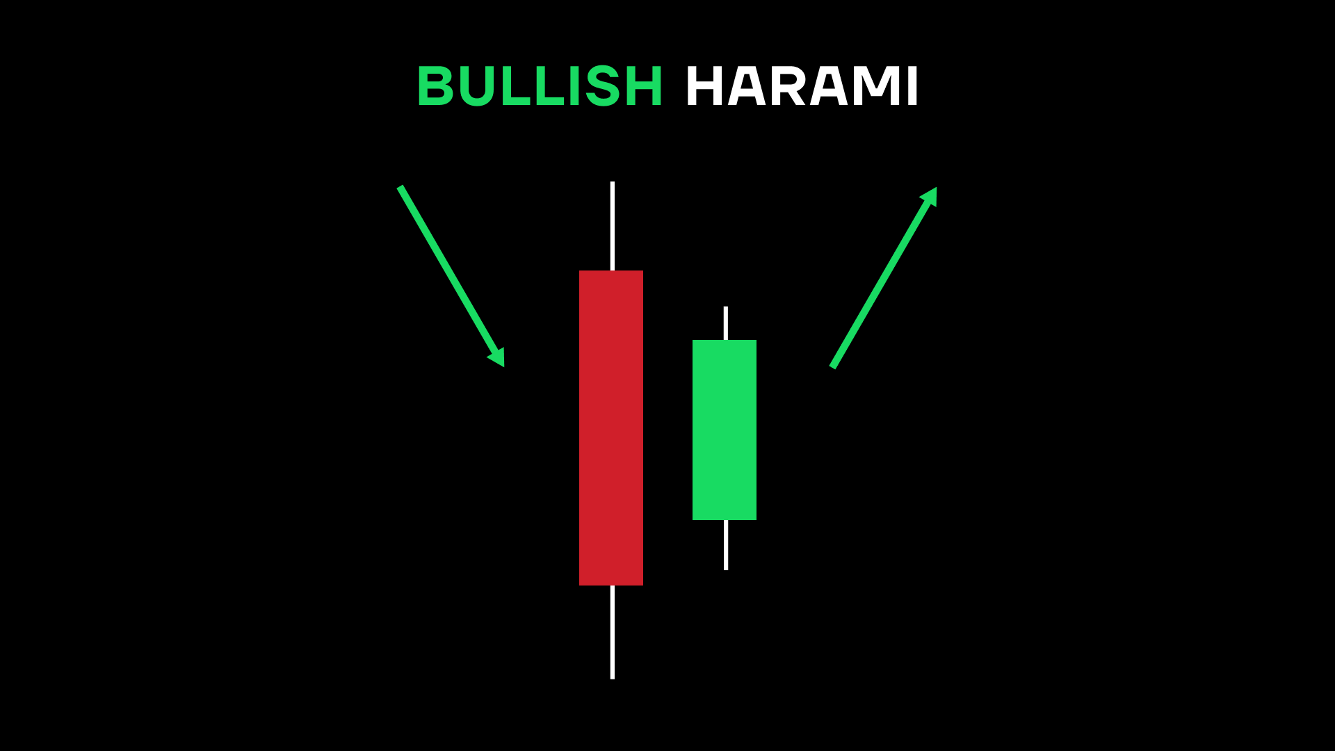
Bullish Harami
This candlestick explained best by the previous pattern but reversed. The Bullish Harami pattern is the flipped version of the bearish one. Same pattern, different direction. Sometimes, reading stock candles is the same in bearish/bullish modes.
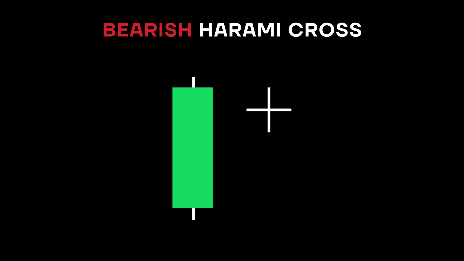
Bearish Harami Cross
Have you ever heard of a “doji”? No, it’s not something a samurai lives in. A doji is a candle almost without a fat part, i.e. the one in which the open and the close prices are nearly identical. It looks exactly like a cross, hence the pattern name. In a Bearish Harami Cross pattern, several green candles are followed by a doji. This could indicate that the uptrend is losing steam (or lost it entirely) and a reversal is imminent.
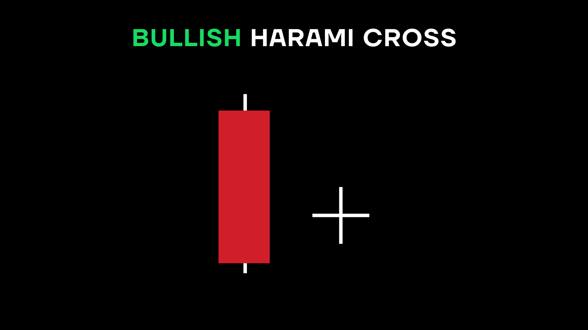
Bullish Harami Cross
As you may expect, a Bullish Harami Cross pattern is the opposite of the bearish one, with several red candles followed by a doji. Just like with the bullish harami cross, traders look at this as an indication of an upcoming trend reversal.

Key takeaways
Candlesticks explained simply are great for telling whether the closing price was close to the opening price, how far the spread went, which way the trend may be going, and more. Choosing different time frames can allow you to capture movements on a scale you’re most comfortable trading with. Most bullish patterns have a bearish “twin” to them functioning in the same way (albeit in a different direction).
